James Rosenquist

Has there been a more falsely idealized decade than the 1960s? Mass consumerism, the collapse of “high” and “low” art, celebrity worship: All seem a prelude to today’s blank monoculture. Pop art trademarked the zeitgeist with an instant visual vocabulary—from Andy Warhol’s soup cans to Roy Lichtenstein’s comic-strip teardrops—endlessly recycled in the amnesiac twenty-first century.
James Rosenquist (1933–2017) was a jolting outlier. Though he ran with the same New York crowd as Robert Rauschenberg and Warhol (who once called Rosenquist his favorite artist), he’s eluded the same level of “brand” status as many of his contemporaries—at least on this side of the pond. “Visualising the Sixties,” an exhibition of Rosenquist’s work from that pivotal decade, made a bold case for his continuing relevance. Turning an oblique eye on the American dream, Rosenquist’s oeuvre balances the brash signifiers of advertising with a subtler sense of looking as both seduction and slow-burn revelation. Unlike Warhol’s production-line icons or Lichtenstein’s emotionally flattened pastiche, Rosenquist’s surfaces pull us into a layered world of often surprising juxtapositions.
Rosenquist began his career painting billboards in Times Square. In his personal practice, he tended toward vast canvases that dwarf the viewer. These have the effect of distancing—and defamiliarizing—his quotidian subject matter: We witness the detritus of Western civilization as if through a telescope, seen from the moon. In Shadows, 1961, the composition is split into three sections. The middle region is a sizzling shade of fuchsia. Within this swath of color, we find two human profiles, one the shadow of the other. On the left side, a burning match seems to hover in a downpour of rain, while on the right section ripples spread in concentric circles, recalling the grooves of a vinyl record. Coenties Slip Studio, painted the same year, transports us to the Lower Manhattan neighborhood the artist moved to in 1960. An egg served sunny-side up suggests the sun; another fragment offers a glimpse of Rosenquist’s studio reflected in a spoon. The right side of the canvas is shaped, a graceful curve following the silhouette of a woman’s falling hair: temptation’s lingering freeze-frame.
Rosenquist favored elision—the tantalizing frustration of the incomplete—within his solitary fantasy world. In Morning Sun, 1963, the nose and lips of a woman are turned upside down; we see a lipstick mark on porcelain flesh. The brash yellow of a sliced grapefruit explodes the mute blue of the canvas. Ripped from their original contexts, these images lure the eye in, only to confront the viewer with the flatness of the surface. In The Light That Won’t Fail I, 1961, a plastic comb runs along the top of the canvas, which contains three smoky, languorous images: one portraying a pair of slender black-stockinged feet, another a cigarette between two shadowy fingers, and the third a woman’s face. We encounter the partial snippets of a noirish cinematic narrative, prompting us to fill in the gaps.
The artist dealt in oblique fragments, shot through with playfulness. Indeed, this exhibition was really two shows, running in parallel. Alongside the monumental canvases were the artist’s collages. Marvels of compression, these effervescent works fizz with ideas. They read like road maps of the postwar American psyche: U-Haul, Ford automobiles, Hollywood starlets such as Joan Crawford and Marilyn Monroe (living, luminous projections of, and screens for, capitalism’s desiring unconscious), and close-ups of consumer goods such as tinned spaghetti or pile rugs.
While Rosenquist’s canvases put an emphasis on tactility, the artist also experimented with assemblage. A copy of his colossal Forest Ranger, 1967, is a startling example. To create this interactive work, the artist began with three Mylar sheets printed with Pop imagery; one depicts an army tank, another a hacksaw. Rosenquist cut the sheets into thin strips, hanging the shredded plastic from a mobile of suspended metal bars; the viewer can then pass through the strips like a beaded curtain. Reification, 1961, spells out the title’s first three letters through a series of lightbulbs, only a handful of which still work. This gesture captures something of Pop art’s melancholic undertow and its yearning to outrun depletion.
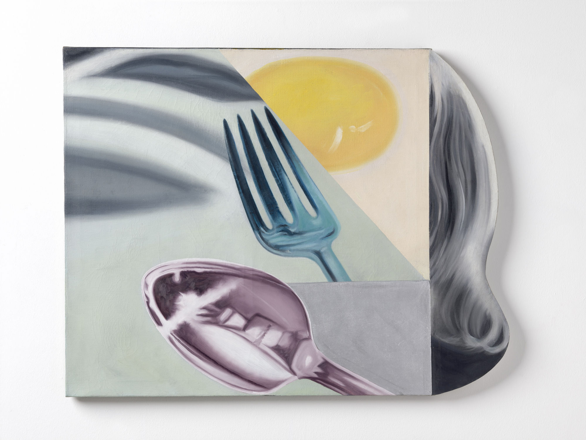
James Rosenquist, Coenties Slip Studio, 1961, oil on canvas and shaped hardboard, 34 × 43". © James Rosenquist