Expanded Horizons: American Art in the 70s Expanded Horizons: American Art in the 70s

Expanded Horizons: American Art in the 70s

21 Septembre 2024—1 Février 2025
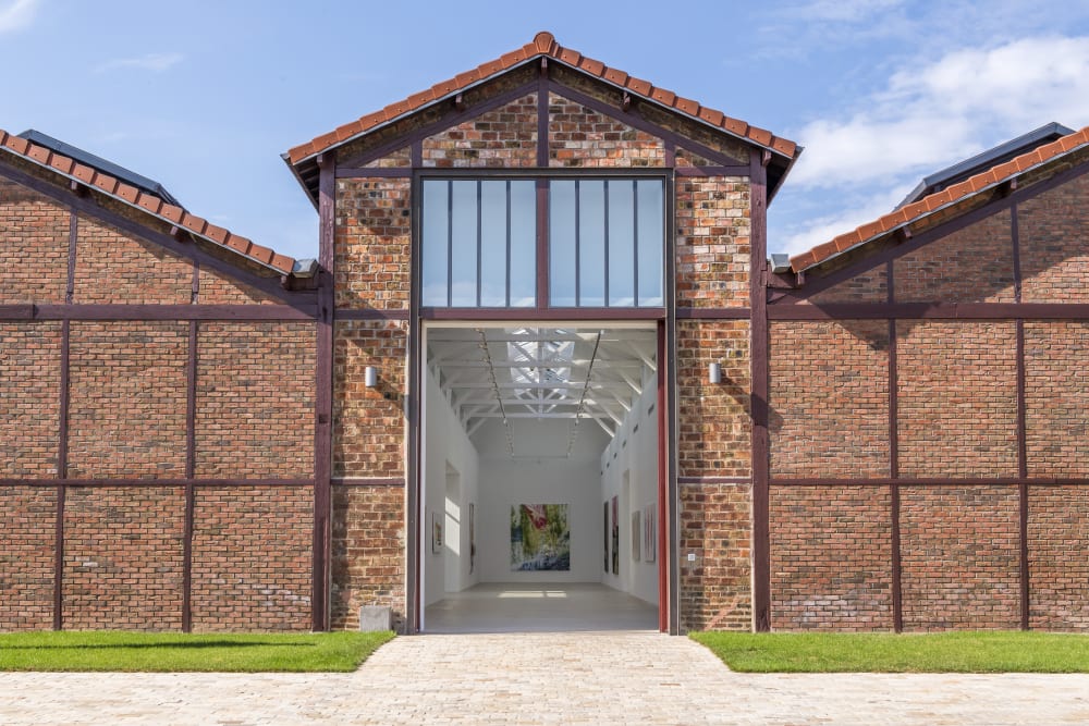
Paris Pantin

Scroll down to learn more
/
Assembling major works by 21 of the most influential artists working in the United States in the 1970s, Expanded Horizons: American Art in the 70s retraces the radical artistic developments of this pivotal decade. Brought into conversation, the works on view reflect how these pioneering artists broke down the conventions of artmaking in a historical rupture which, for art historian Rosalind E. Krauss, marked the opening up of ‘the expanded field of postmodernism’.

The exhibition highlights practices that challenged contemporaneous conceptions of art, whether through a radically egalitarian approach to materials or a deepened engagement with the physical space or the sociopolitical concerns of the world surrounding them. 

Wall Drawing #122 (1972) is part of Sol LeWitt’s visionary series of large-scale mural drawings which he commenced in 1968 and pursued until his death in 2007. Crystallising his cerebral practice, LeWitt conceived of specific instructions and diagrams to enable his assistant drafters to execute the works directly onto the wall. In the artist’s words, ‘the idea or concept is the most important aspect of the work’ (Artforum, 1967).

Sol LeWitt
Wall Drawing #122, 1972
Blue crayon, black pencil grid.
A 36-inch (90 cm) grid covering the wall. All combinations of two lines crossing, placed
at random, using arcs from corners and sides, straight, not straight, and broken lines.
Each 36-inch (90 cm) square contains one combination.
When an artist uses a conceptual form of art, it means that all of the planning and decisions are made beforehand and the execution is a perfunctory affair. The idea becomes a machine that makes the art. — Sol LeWitt
Yellow Nunn (1975) exemplifies John Chamberlain’s avant-garde sculptural practice. In the mid-1970s, the artist almost exclusively employed automobile parts as...
Yellow Nunn (1975) exemplifies John Chamberlain’s avant-garde sculptural practice. In the mid-1970s, the artist almost exclusively employed automobile parts as a medium, expanding his technique by cutting and painting the steel. His dynamic spatial abstractions tapped into the energy of Abstract Expressionism, propelling it into the tridimensional realm.
 
John Chamberlain
Yellow Nunn, 1975
Painted and chromium-plated steel
115 x 163 x 102 cm (45.28 x 64.17 x 40.16 in)
Donald Judd established a groundbreaking three-dimensional visual language, exemplified by this work from 1973 which intervenes directly in the space,...

Donald Judd established a groundbreaking three-dimensional visual language, exemplified by this work from 1973 which intervenes directly in the space, jutting out from the wall upon which it is mounted. Judd gives primacy to the inherent qualities of the medium and, as such, Untitled encapsulates his conception of real art - one that speaks for itself, emphasising what is.

Donald Judd
Untitled, 1973
Copper
25.4 x 182.9 x 66 cm (10 x 72 x 26 in)
Actual space is intrinsically more powerful and specific than paint on a flat surface. — Donald Judd
Between 1971 and 1972, Robert Rauschenberg created Cardboards, a series in which he cut, stapled, bent and combined found cardboard...
Between 1971 and 1972, Robert Rauschenberg created Cardboards, a series in which he cut, stapled, bent and combined found cardboard boxes to create artworks that retain their original history through stains, dents, tears, and even labelling, tying into the artist’s exploration of unassuming media during the 1970s.
   
Robert Rauschenberg
Parsons' Live Plants Ammonia (Cardboard), 1971
Assembled carboard boxes
196 x 120 x 15 cm (77.17 x 47.24 x 5.91 in)
In line with his pioneering practice, Rauschenberg’s sculptural assemblages of discarded cardboard boxes subvert traditional understandings of art. In the...
In line with his pioneering practice, Rauschenberg’s sculptural assemblages of discarded cardboard boxes subvert traditional understandings of art. In the artist’s own words, ‘If you take something that no one looks at and you displace it successfully then people will look at it as though it’s theirs and beautiful.'

Robert Rauschenberg
Untitled, 1972
Painted cardboard boxes
137 x 33 x 30.5 cm (53.94 x 12.99 x 12.01 in) 
155 x 41 x 33 cm (61.02 x 16.14 x 12.99 in)
 
Rauschenberg’s Bank Job (Spread) of 1979 is part of his experimental Spread series of large-scale multimedia works made between 1975 and 1983. For Rauschenberg, ‘“Spread” means as far as I can make it stretch, and land (like a farmer’s ‘spread’), and also the stuff you put on toast.’ Bank Job (Spread) was Rauschenberg’s largest work at the time of its creation. Made up of 15 panels, it is one of the most monumental works the artist ever produced and is shown here for the first time in Europe, having been in the collection of the Baltimore Museum of Art until 2018.
The work’s flat panels are interspersed with mirrored structures that jut out at angles, reflecting the viewers and thereby blurring...
The work’s flat panels are interspersed with mirrored structures that jut out at angles, reflecting the viewers and thereby blurring the boundaries between art and life. Recalling Rauschenberg’s earlier Combines, Bank Job (Spread) also integrates unconventional found objects, as epitomised by the outstretched shirt that dominates the composition. In the artist’s own words, ‘a picture is more like the real world when it’s made out of the real world’.
  
Robert Rauschenberg
Bank Job (Spread), 1979
Solvent transfer images and fabric collage with coloured mirrors, carboard,
acrylic paint and reflector on gessoed wooden construction, in 15 parts
330.5 x 909 x 81 cm (130.12 x 357.87 x 31.89 in)
A pair of socks is no less suitable to make a painting than wood, nails, turpentine, oil and fabric. — Robert Rauschenberg
Exploring the interplay between light and space, Dan Flavin repurposed commercially available fluorescent lights to make the sculptural object on...
Exploring the interplay between light and space, Dan Flavin repurposed commercially available fluorescent lights to make the sculptural object on view. The lightbulbs create a captivating luminous pattern that transcends the physical confines of the work to intervene in the space it inhabits. Flavin’s use of the corner, an unorthodox display method, subverts traditional modes of exhibition, further mediating the viewers’ spatial experience of the artwork.
  
Dan Flavin
Untitled, 1972
Red and blue fluorescent lights
60.96 cm (2 ft) wide across corner
Ed. 2 of 5
Robert Ryman’s white paintings are never truly about the colour white, they’re about everything else: surface, gesture, tension and balance....
Robert Ryman’s white paintings are never truly about the colour white, they’re about everything else: surface, gesture, tension and balance. They become a place for deep looking because once you establish the familiar, or the constant (white), you can then think about other formal aspects and decisions Ryman made in the work. — Alvaro Barrington
 
Robert Ryman
Untitled, 1974
Gloss paint on PVC
34 x 34 cm (13.39 x 13.39 in)
 
Horizon Home Sweet Home (1970) materialises James Rosenquist’s notion of ‘painting as immersion’. The monumental installation comprises 21 painted canvases and 6 panels stretched with silver Mylar, as well as dry ice fog that envelops the viewers’ legs as they move through the exhibition space. As Rosenquist explained, ‘I chose the colors by experimenting with how they would react to the different effects. Some would be one color, blue or white; others would be multiple colors, shaded from red to darkness and from pink to darkness to orange. The effect was that of a horizon or a sunset. All these horizons searching for home.’ 
 

The fog, which fills the room at allotted times, orients and disorients viewers in the room installation, adding an experiential dimension to the work. As Rosenquist set forth, ‘I had an idea about dislocation in space. […] To achieve the feeling of dematerialization, I wanted to create an effect of painted panels that appeared to be floating in space. […] It was an extension of my concept of dissolving the painting as an object, immersing the viewer in the painting, and making it an environment – color as a state of mind.’

James Rosenquist
Horizon Home Sweet Home, 1970
Oil on canvas, with aluminised polyester film (Mylar) and dry ice fog
27 panels, each: 259.1 x 101.6 cm (102 x 40 in)
To me, the paintings only make sense as a question. Through my life, weird juxtapositions of time, ideas, and seeing...
To me, the paintings only make sense as a question. Through my life, weird juxtapositions of time, ideas, and seeing things made me wonder about my own existence. I try to put that down in a picture. — James Rosenquist
  
James Rosenquist
Screen Test, 1975
Oil on canvas
173 x 422 cm (68.13 x 166.13 in)
Expanded Horizons is pervaded by a dynamic sense of motion. In this monumental work, Alex Katz depicts a rehearsal for...
Expanded Horizons is pervaded by a dynamic sense of motion. In this monumental work, Alex Katz depicts a rehearsal for the Paul Taylor Dance Company’s Private Domain performance, for which the artist designed the set and costumes. All of the figures overlap in the flat pictorial space, lined up behind Paul Taylor, whose prominent profile is depicted in the foreground. Katz transposes the ‘all-over’ treatment of the canvas found among Abstract Expressionists to create a figurative painting that gives a sense of a boundless, immeasurable reality.
 
Alex Katz
Private Domain, 1969
Oil on linen
290.2 x 609.2 cm (114 .25 x 239.84 in)
 
Joan Brown Acrobats + Spectator on New Year’s Eve, 1974 Oil on canvas 245 x 198 cm (96.5 x 78...
Joan Brown Divers, 1974 Sheet metal, acrylic, and aluminium on wood 130 x 91 x 156 cm (51 x 36...
This potent sense of movement is also captured in Joan Brown’s exhibited works, in particular Divers (1974). Consisting of a wooden and metal construction suspended from the ceiling by its four corners, this formally inventive hanging work blurs the lines between painting and sculpture. Swimming figures cut out of aluminium are affixed to the picture plane at a right angle, as if diving in and out of the canvas. While the figures are painted in Brown’s signature flat planes of colour, echoing Katz’s work, their immersed body parts are left untouched, the bare surface of the aluminium ingeniously suggesting the shimmering water beneath.
 
Rosemarie Castoro ARCHES ARE MOUNTAINS, 1974 5 elements: epoxy, styrofoam, fibreglass, steel, paint/pigment Overall 43 x 167 x 71 cm...
Rosemarie Castoro’s works are also informed by a performative awareness of space rooted in the artist’s background in experimental dance....
Rosemarie Castoro’s works are also informed by a performative awareness of space rooted in the artist’s background in experimental dance. Castoro called herself a ‘paintersculptor’ – a practice exemplified by Climbing (1972), wall reliefs that occupy a liminal space between painting and sculpture. Applying gesso to Masonite panels using a broom, Castoro created textural, gestural striations that resemble blown-up brushstrokes, into which she then rubbed graphite. In her own words, ‘My ocean is made of graphite in front of which I tumble, chase, flop over.’ Castoro’s highly embodied engagement with her medium would distinguish her from her Minimalist peers.
 
Rosemarie Castoro
Climbing (Brushstroke), 1972
Masonite, gesso, marble dust, modelling paste, graphite
182.9 x 365.8 cm (72 x 144 in)
Senga Nengudi employs everyday materials and discarded objects to create poetic conceptual installations that stand in for bodies, while also...
Senga Nengudi employs everyday materials and discarded objects to create poetic conceptual installations that stand in for bodies, while also functioning as sites for performance. The works on view belong to her influential Water Composition series of heat-sealed vinyl forms that the artist filled with water dyed with food colouring, letting their shape be determined
by gravity and entropy.
  
Senga Nengudi
Untitled 1, 1980/2023
Vinyl and water
152 x 36.5 cm (59.84 x 14.37 in)
 
To shape shift paradigms I find different ways to use materials others consider useless or insignificant providing proof that the...

To shape shift paradigms I find different ways to use materials others consider useless or insignificant providing proof that the disregarded and disenfranchised may also have the resilience and reformative ability to find their poetic selves. — Senga Nengudi

Senga Nengudi
Water Composition III, 1969–70/2018
Heat-sealed vinyl, coloured water, rope
91 x 120 x 73 cm (35.83 x 47.24 x 28.74 in)


Untitled (c. 1970) exemplifies David Hammons’ transgressive ‘body print’ practice. The artist would grease his body before pressing it against...
Untitled (c. 1970) exemplifies David Hammons’ transgressive ‘body print’ practice. The artist would grease his body before pressing it against a paper support, sprinkling the imprint with powdered pigment or graphite and embellishing it with minute details of skin, hair or clothing. Harnessing the political potential of his own body, Hammons’ imprints explore his embodied experience as a Black man in the United States. The delicate materiality of the body print on view has a haunting, spectre-like quality that invokes politically charged notions of invisibility.
 
David Hammons
Untitled, c. 1970
Grease and dry pigment on paperboard
74 x 48.5 cm (29.13 x 19.09 in)
 
Piss Painting (1977–78) is part of a series for which Andy Warhol instructed members of his studio to urinate on primed canvases, supplanting the paintbrush with the body and its elemental functions. In the words of writer and critic Bruce Hainley: ‘Piss is paint readymade.’ A monumental Piss work, measuring almost five metres in length, is displayed in Expanded Horizons, highlighting the transgressive material experimentation that runs through the exhibition. Despite its irreverence, the work is formally enticing, with the golden tones of the unconventional medium delineating an entrancing marbled pattern replete with the visceral energy of Action Painting.  
 
Andy Warhol
Piss Painting, 1977–78
Urine on linen
198.5 x 492.1 cm (78.15 x 193.74 in)
 
Irving Penn explores states of decay in his Cigarettes photographs, picking up cigarette butts from the street to photograph them...
Irving Penn explores states of decay in his Cigarettes photographs, picking up cigarette butts from the street to photograph them in his studio, and thereby elevating them to the status of art. Through the magnification and close cropping of the cigarettes as well as dramatic contrasts of chiaroscuro illumination, the photographs invite the viewer to consider the formal beauty of a discarded object.
 
Irving Penn Cigarette No. 48, New York, 1972, print made 1975 Platinum-palladium print mounted to aluminium 59.7 x 47 cm...
Irving Penn Cigarette No. 37, New York, 1972, print made 1975 Platinum-palladium print mounted to aluminium 59.1 x 43.2 cm...
Irving Penn Cigarette No. 17, New York, 1972, print made 1974 Platinum-palladium print mounted to aluminium 59.4 x 47 cm...
Irving Penn Cigarette No. 98, New York, 1972, print made 1974 Platinum-palladium print mounted to aluminium 58.9 x 43.2 cm...
Sam Gilliam’s pivotal Drape series was inspired by the works of Yves Klein and Morris Louis, as well as laundry...
Sam Gilliam’s pivotal Drape series was inspired by the works of Yves Klein and Morris Louis, as well as laundry hanging on clotheslines glanced from his studio window. In the works on view, the artist fashions unstretched canvas into garment-like shapes that hang from the wall. Liberating the canvas from the stretcher, Gilliam’s Drape works straddle both the wall and 
the tridimensional realm, thus collapsing the space between
painting and sculpture.
  
Sam Gilliam
Green Half Circle, 1973
Acrylic on draped canvas
269.2 x 118 cm (106 x 46.5 in)
Installed (variable) 210.8 x 104.1 x 22.9 cm (83 x 41 x 9 in)
The liquidity of the colors was reinforced by the fluidity of the canvas. Paint and surface took on an added,...
The liquidity of the colors was reinforced by the fluidity of the canvas. Paint and surface took on an added, third-dimensional reality. Now the canvas was not only the means to, but a primary part of, the object. The suspended paintings began by celebrating the working process and ended with the involvement of the wall, the floor, and the ceiling. — Sam Gilliam

Sam Gilliam
Half Circle Cowl, 1973
Acrylic on draped canvas
271.8 x 120.7 cm (107 x 47.5 in)
Installed (variable) 210.8 x 83.8 (83 x 33 in)
Fusing autobiography with abstraction and content with form, Joan Snyder breaks down aesthetic and material hierarchies to assert the place...
Fusing autobiography with abstraction and content with form, Joan Snyder breaks down aesthetic and material hierarchies to assert the place of feeling and female subjectivity at the heart of her practice. In this triptych, the artist embeds dried leaves into the pale-pink impastos of the central panel, giving the work an unconventional tri-dimensionality imbued with affect. 
 
Joan Snyder
Small Vanishing Theatre, 1975
Oil on canvas
30.5 x 45.7 cm (12 x 18 in)
Joan Snyder Vanishing Theatre/The Cut, 1974 Oil, acrylic, paper mache, thread, fake fur, paper, chicken wire on canvas 152.4 x...
A key figure of the women’s art movement that flourished in the 1970s, Joan Snyder sought to visualise her conception...
Joan Snyder with Vanishing Theatre/The cut, 1974. Photography : Larry Fink
A key figure of the women’s art movement that flourished in the 1970s, Joan Snyder sought to visualise her conception of ‘a female sensibility’ in Vanishing Theatre/The Cut (1974). The central, most expansive panel of the tripartite painting is dominated by a diagonal slit that traverses the picture plane. As art historian Hayden Herrera writes, ‘the long slash is clearly the drama’s climatic moment, [...] it is truly hair-raising. Snyder has tried to sew the cut up, but the chicken wire ‘pod’ that she has stuffed into the cut is too large to allow the flaps of the canvas to meet: the wound cannot be closed.’


Judy Chicago’s pioneering ecofeminist work, Women and Smoke (1971–72), sought to ‘soften and feminise’ the landscape. Between 1968 and 1974,...
Judy Chicago’s pioneering ecofeminist work, Women and Smoke (1971–72), sought to ‘soften and feminise’ the landscape. Between 1968 and 1974, the artist executed a series of fireworks pieces – a form of ‘painting in the sky’ – that involved site-specific performances across Southern California, which she immortalised in the video work. Amid plumes of coloured smoke, female performers re-enact gynocentric activities, such as the worship of goddess figures. These hypnotic, experimental tableaux depict myriad ways in which women commune with nature in a gesture towards eco-feminist emancipation. Through Women and Smoke, Chicago demonstrates her visionary approach to artistic creation as a tool to
enact socio-environmental change.
  
Judy Chicago
Women and Smoke, California, 1971–1972, remastered in 2016 and edited by Salon94 in 2017
Running time 14:45
AP1, Ed. of 20 + 2APS
Bringing into dialogue an exemplary body of works from this transformative decade, the exhibition sheds light on the multiform artistic expansions of the 1970s. Through an unconventional use of materials and a common desire to deepen the way art occupies and interacts with the physical and conceptual landscape, the distinct practices of the more than 20 artists on view are ultimately united by a search to forge new lines of expression that spoke to the realities of the rapidly changing world around them, expanding art-historical conversation in a way that remains relevant to this day.
 
    Atmospheric image Atmospheric image
    Atmospheric image Atmospheric image
    Atmospheric image Atmospheric image